Modern White Stone in Minneapolis Condo Loft
Several years ago our White Rock Panels were used on a very cool condo loft project in Minneapolis, Minnesota. This space has some very interesting stone design elements to it, including the vertical installation of the stone panels, as well as a unique take on how to use stacked stone panels on a column. Come with us on a quick tour around this unique space to see what it makes it so cool!
As far as the space itself is concerned, the term “loft” when used to describe a multifamily apartment or condo building has become overused over the past several years. The fundamental design it tries to convey is a large open space with great natural light, high ceilings, that are typically on one floor of a multi level building. The original “loft” style buildings were re-purposed factories and industrial buildings in cities like New York, that were often in less desirable neighborhoods with lower rents that attracted artists that popularized the open concept design. Today, many new construction buildings are designed along these same ideals, maximizing ceiling height, open space and natural light.

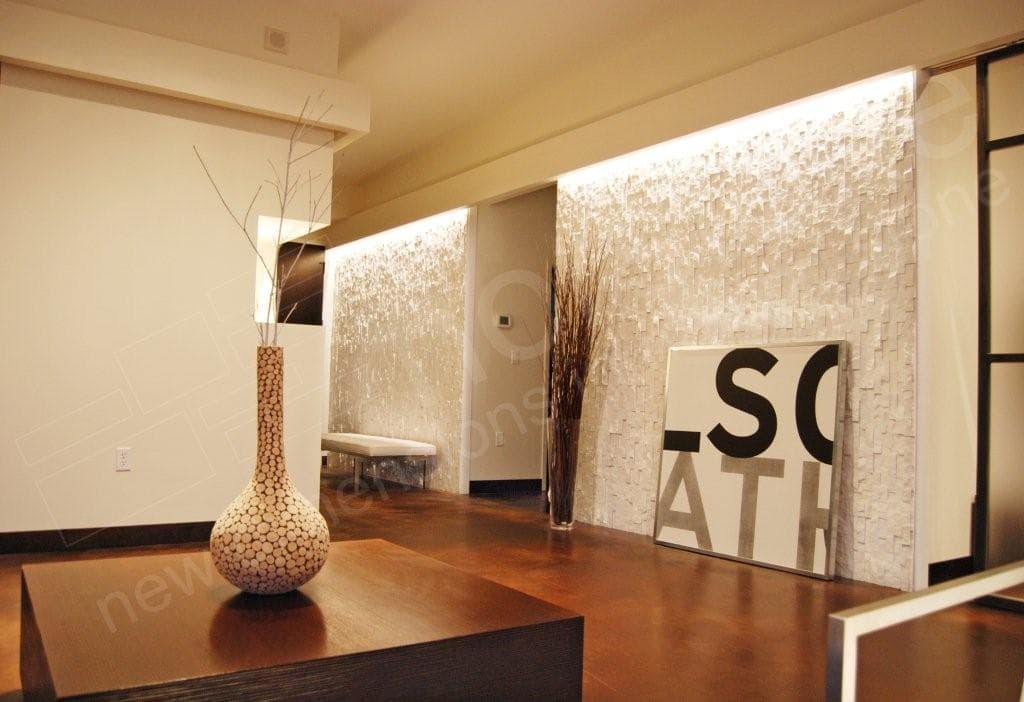
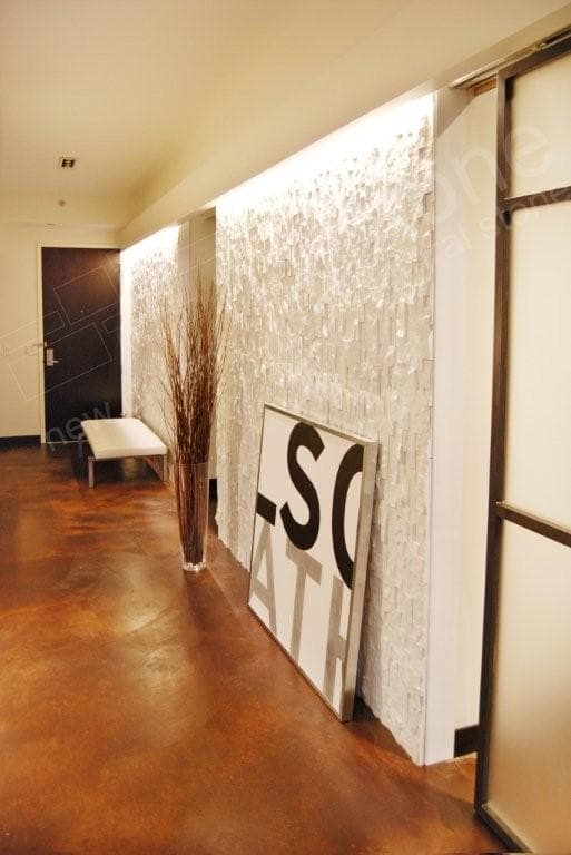
One of the first things that catches our eye on this installation is the modern color pallete. The white stone feature walls flanking the entry foyer combined with the freshly painted white walls dominate the space, adding to the already open and bright feel. What we really like though is the English leather brown color of the stained concrete floors. While the design team opted for lots of black accents throughout the space, including the baseboards, cabinets and doors, a darker colored floor would really amp up the modern feel of the space and start to limit potential resale value. In addition to reinforcing the light colors of the design scheme, the White Rock Panels also are a great contrast in texture as compared to the smoothness of the rest of the finishes.

Vertically installing the stone panels is another very unique aspect of this project. A vertical installation, where the 24” side of our rock panels are run vertically, accentuates the height of any space and also lends itself towards a more modern look. Furniture that is low to the ground and the large art piece that is resting on the floor keep your eyes towards the ground which also helps make the ceilings feel taller.

We’ve talked before about how lighting is an important part of a stone installation, and were very happy to see the overheard recessed light strips on the two main stone feature walls of this space. The White Rock Panels, because of their color, can look a fair bit different depending on the type of light being cast on them. The ultra pure white LED down lighting used in this installation does a great job of creating a dramatic effect and highlighting the texture of the stone feature wall.

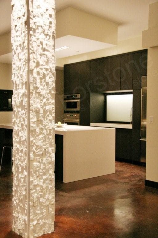
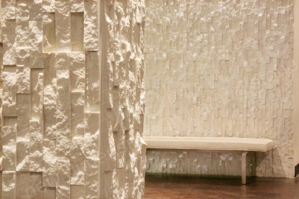
The last thing that catches our eye on this project is the super unique way the design and installation team decided to wrap the interior column. Our stone veneer corner units are designed to be installed with a traditional horizontal orientation, so in keeping with the vertical orientation of the feature wall, the rock panels were installed on the column leaving the long cut edge of the panel exposed at the corner. The drawback of installing stone on a column like this is that it doesn’t “hide” the fact that the stone used on the walls and column is a veneer as opposed to a full bed stone, however it does give the column a very modern clean lined look which does fit nicely with the rest of the design cues of the space.
Thanks for taking a quick tour of this unique condo loft space in the upper Midwest. We hope it inspires you to take some risk with your next stacked stone project and incorporate some of the design ideas talked about today. Speaking of design, we have in house design experts ready to talk to you about using natural stone wall coverings for your next project, so don’t hesitate to contact us today to learn more.
.png)


